Home
Home
Why Pastel Blue Color Is the Ultimate Cheat Code for Calm Design

Pastel blue color represents a unique intersection of serenity and modern sophistication. In the landscape of 2026, where digital saturation and high-contrast visuals often dominate the senses, this muted hue provides a much-needed psychological "reset." It is characterized by high lightness and low saturation, a combination that results in a visual experience that is cooling rather than cold, and soft rather than weak. Understanding the nuances of this color is essential for anyone involved in visual communication, from product designers to homeowners looking to refresh their space.
Decoding the Technical DNA of Pastel Blue
To use pastel blue color effectively, one must first understand its technical composition. While many people use "light blue" and "pastel blue" interchangeably, they are distinct in the world of color theory. Pastel blue typically features a lower saturation level, giving it a "chalky" or "dusty" undertone that pure light blue lacks.
Technically, the most recognized version of pastel blue in digital design often carries the hex code #aec6cf. However, variations exist depending on the specific mood required:
- Classic Pastel Blue (#aec6cf): A balanced, stony blue that feels grounded and professional.
- Vibrant Pastel (#b3ebf2): Slightly closer to cyan, offering more energy for UI elements.
- Dusty Pastel (#b0e0e6): Often referred to as powder blue, this has a higher white content for maximum softness.
In the RGB space, the classic #aec6cf is composed of approximately 68.2% red, 77.6% green, and 81.2% blue. This heavy leaning toward the blue and green channels, while maintaining a significant amount of red, creates that signature soothing effect. For print applications, the CMYK values lean toward 16% Cyan, 4% Magenta, 0% Yellow, and 19% Black, which ensures the color doesn't turn too "vivid" when hitting the paper.
The Psychology of Tranquility and Trust
Color psychology suggests that blue is inherently linked to stability and reliability. When you dial down the intensity to create a pastel blue color, these associations become more approachable. It removes the "authoritative" edge of navy blue and replaces it with a sense of openness and honesty.
In 2026, the concept of "digital wellness" is a significant driver in design trends. Pastel blue color is often the primary choice for wellness apps, meditation platforms, and healthcare portals because it is thought to lower the heart rate and reduce cognitive load. Unlike aggressive reds or yellows that demand immediate attention, pastel blue invites the eye to linger without fatigue. It symbolizes a state of "repose"—a temporary withdrawal from the chaos of the world to regain mental clarity.
Cultural perceptions also play a role. In many Eastern and Western traditions, these soft blue tones are associated with spirituality and the infinite nature of the sky. It is a color that suggests there is plenty of space to breathe, making it a powerful tool for branding in industries that value transparency and peace of mind.
A Journey Through History: From Rococo to the Digital Age
The history of pastel blue color is as rich as the hue is delicate. The term "pastel" itself originates from the Italian word "pastello," referring to the small sticks of powdered pigment used by artists as far back as the 18th century. During the Rococo era, pastel shades were the height of fashion and interior decor. It was the preferred palette of the French aristocracy, symbolizing a life of leisure and refinement.
Moving into the 20th century, pastel blue experienced a massive resurgence in the 1950s as a symbol of domestic modernism, found on everything from kitchen appliances to luxury automobiles. By the 1980s, the color was reimagined through the lens of neon and pop culture—think of the iconic architecture of Miami Beach, where pastel blue was paired with coral and mint green to define a generation of coastal style.
Today, the color has matured. In 2026, it is no longer just seen as a "nursery color." It has been reclaimed by high-end tech firms and minimalist fashion houses as a marker of "quiet luxury." It represents a shift away from flashy displays of wealth toward a more subtle, thoughtful aesthetic.
Strategic Application in UI and UX Design
For digital products, the use of pastel blue color requires a delicate balance of aesthetics and accessibility. While the color is undeniably beautiful, it can present challenges regarding contrast ratios, which are vital for users with visual impairments.
The Contrast Trap
Designing with pastel blue backgrounds often leads to issues with white text. For instance, putting white text on a #aec6cf background usually fails the WCAG (Web Content Accessibility Guidelines) contrast requirements for normal text. To solve this, designers should consider:
- Dark Navy Text: Using a deep charcoal or navy blue for typography on a pastel background provides excellent readability while maintaining the cool color harmony.
- Layering with Shadows: Subtle drop shadows can help separate pastel blue elements from a white background, adding depth without sacrificing the soft aesthetic.
- State Indicators: Pastel blue is highly effective for highlighting input fields or active states in a navigation bar. It draws the eye without creating the "visual noise" that a brighter blue might cause.
Micro-interactions and Focus
In modern interfaces, pastel blue is often used for "secondary" actions. It suggests that a button is clickable but not the primary focus of the page. This helps in creating a visual hierarchy that feels natural and unforced. For example, a "Cancel" button in a pastel blue tone feels much more forgiving than one in a stark gray or bold red.
Transforming Spaces: Pastel Blue in Interior Design
In the physical world, pastel blue color has a transformative effect on room dynamics. Because blue is a receding color, it has the optical property of making walls seem further away than they actually are. This makes it an ideal choice for smaller rooms or apartments where the goal is to create a sense of expansiveness.
Lighting Considerations
The appearance of pastel blue is highly dependent on the light source.
- Natural North Light: In rooms with northern exposure, the light is naturally cooler. This can make pastel blue feel slightly more "chilly" or gray. To counter this, pairing the blue with warm wood tones or brass fixtures can create balance.
- Incandescent and Warm LED: These light sources add a yellow tint to the room, which can turn some shades of pastel blue slightly greenish. Testing a paint sample at different times of the day is recommended.
- Matte vs. Gloss: A matte finish on a pastel blue wall will emphasize its soft, powdery nature, whereas a high-gloss finish will make the color feel more modern and energetic.
Material Pairings
To keep a pastel blue room from feeling too "precious" or juvenile, interior designers in 2026 are increasingly pairing it with raw, industrial materials. Imagine a pastel blue accent wall behind a concrete floor or a reclaimed oak dining table. The contrast between the soft color and the rugged texture creates a sophisticated, contemporary vibe.
2026 Fashion Trends: The Evolution of the Blue Palette
In the world of fashion, pastel blue color has moved beyond spring seasonal collections. It is now treated as a year-round neutral. The key to wearing it in 2026 lies in the mix of textures and the deliberate use of silhouette.
- Monochromatic Layering: One of the most prominent trends is the use of various shades of pastel blue in a single outfit. Mixing a silk pastel blue blouse with a heavier wool coat in a slightly darker shade of the same hue creates a rich, textured look that feels incredibly expensive.
- The Utility Shift: We are seeing pastel blue applied to utility wear—cargo pants, trench coats, and structured blazers. This juxtaposition of a "tough" garment with a "soft" color is a hallmark of current style.
- Sustainability and Natural Dyes: As the industry moves toward more eco-friendly practices, pastel blue is often achieved through natural minerals and plant-based dyes. This gives the fabric a slightly irregular, organic feel that aligns perfectly with the color's serene nature.
Masterclass in Color Palettes: What Goes with Pastel Blue?
Creating a cohesive palette around pastel blue color involves understanding the relationship between temperature and contrast. Here are five reusable palettes that are currently trending:
1. The Misty Lagoon (Analogous)
- Colors: Pastel Blue (#aec6cf), Mint Green, and Soft Teal.
- Vibe: Fresh, organic, and incredibly calming. Best for wellness branding or bedroom interiors.
2. The Sunset Contrast (Complementary)
- Colors: Pastel Blue, Dusty Rose (#dca1a1), and Muted Terracotta.
- Vibe: A sophisticated take on the warm/cool contrast. This palette feels nostalgic yet modern, perfect for editorial layouts.
3. The Minimalist Corporate (Monochromatic)
- Colors: Pastel Blue, Navy Blue, and Slate Gray.
- Vibe: Trustworthy and authoritative without being aggressive. Ideal for financial tech or professional portfolios.
4. The Ivory Coast (Neutral)
- Colors: Pastel Blue, Cream (#ffff e3), and Light Taupe.
- Vibe: Pure elegance. This is the go-to for luxury packaging and high-end hospitality design.
5. The Electric Accent (Triadic)
- Colors: Pastel Blue, Soft Lavender, and Pale Lemon.
- Vibe: Playful and youthful. This works exceptionally well in social media graphics and stationery design.
Mistakes to Avoid When Using Pastel Blue
Despite its versatile nature, it is possible to misapply pastel blue color. One common mistake is "over-saturation" of the space. If every element in a room or a design is pastel blue, the eye loses its point of reference, and the design can feel "washed out" or devoid of character. Contrast is necessary to make the blue pop.
Another error is ignoring cultural context. While blue is generally seen as positive, in some cultures, very pale blues can be associated with mourning or ill health. Always research the specific regional associations if you are designing for a global audience.
Lastly, avoid pairing pastel blue with overly intense neons unless you are specifically aiming for a 1980s retro-revival aesthetic. A neon green or electric yellow will almost always overpower the delicate nature of the pastel blue, causing visual vibration that is uncomfortable for the viewer.
The Future of Pastel Blue: Digital Wellness and AI Design
As we look further into 2026 and beyond, the role of pastel blue color is expected to expand within the realm of generative AI and virtual reality. In VR environments, pastel blue is frequently used to define "safe zones"—areas where users can interact without the stress of fast-paced simulations. It acts as a digital anchor, providing a sense of physical safety in a virtual world.
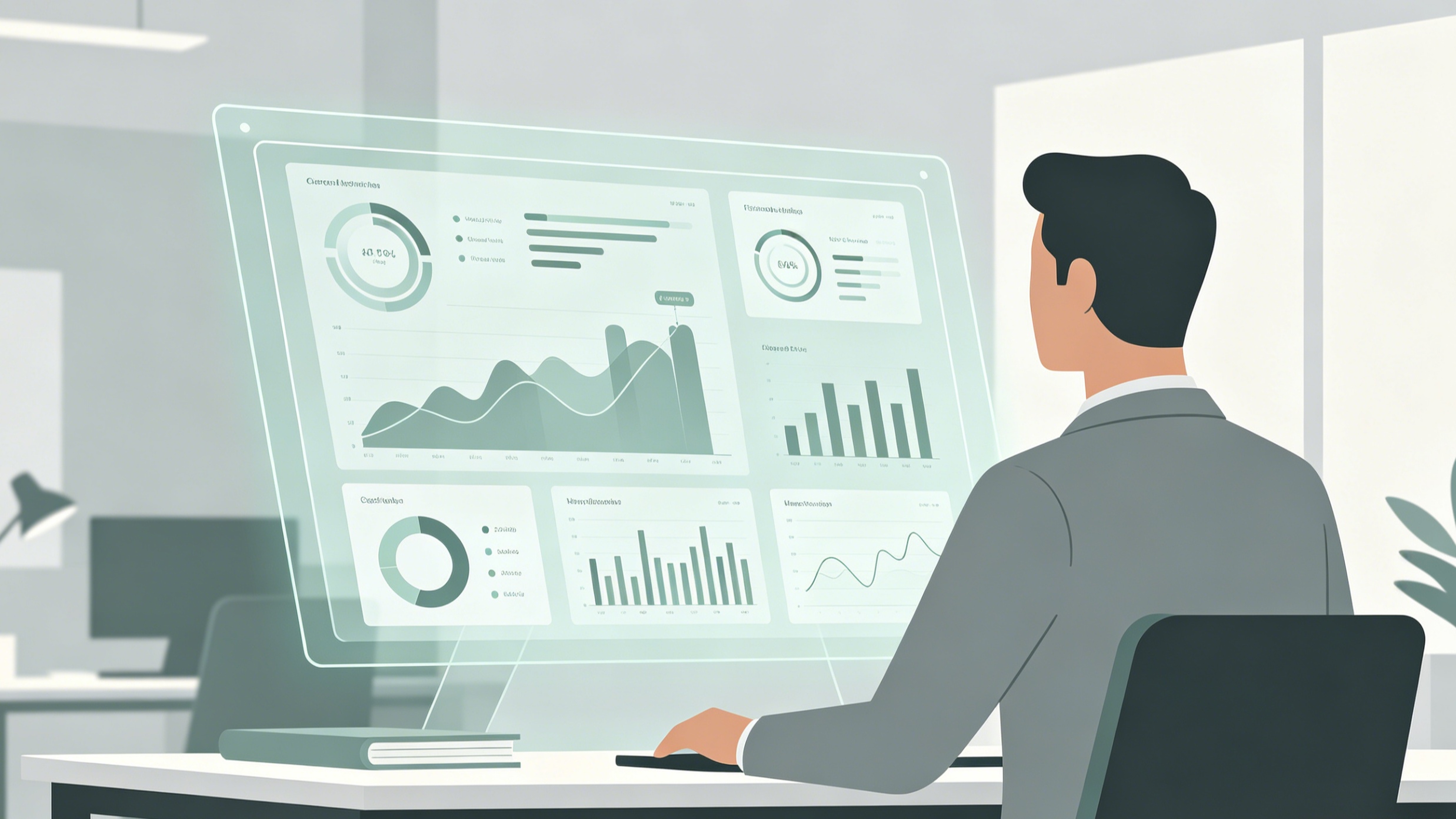
Furthermore, AI-driven design tools are increasingly suggesting pastel blue as a "neutralizing" agent in complex data visualizations. By using this color for secondary data sets, designers can present vast amounts of information without overwhelming the user's brain.
In conclusion, pastel blue color is far more than a simple aesthetic choice. It is a strategic tool for emotional regulation, a bridge between historical elegance and future-proof design, and a versatile neutral that deserves a place in every creator's toolkit. Whether you are painting a wall, coding a website, or choosing an outfit, incorporating this tranquil hue is a proven way to bring a sense of harmony and sophisticated calm to your work. Use it thoughtfully, respect its technical limits, and let its inherent serenity guide your creative process.
-
Topic: Pastel Blue Color: Hex Code, Palettes & Meaning | Figmahttps://www.figma.com/colors/pastel-blue/
-
Topic: Pastel Blue Color Guide: Palettes, Mood, Trendshttps://pastelblue.org/
-
Topic: Pastel Blue RGB, CMYK, HEX Color Codes and Color Meaninghttps://create.vista.com/colors/color-names/pastel-blue/